🎨 Quick Answer
A great party color palette is 2–3 core colors plus one neutral (white, cream, ivory, or sage), not every item matched to the same exact shade. The strongest 2026 combinations include sage green + cream + terracotta, dusty rose + gold + ivory, black + white + gold, and peach + sage + cream. The rule that never fails: pick a dominant color (60%), a supporting color (30%), and one accent (10%), then repeat each at table level, eye level, and overhead.
The best party color palettes don’t announce themselves — they create a feeling. Picture a bridal shower with dusty rose linen runners, ivory pillar candles at varying heights, and eucalyptus sprigs tucked into terracotta pots: three colors, nothing more, and it looks like something out of a magazine for under $80. The parties that stick with people are never the ones with the most stuff; they’re the ones where someone made three smart color choices and committed to them.
Here are the best color palette ideas for every party theme — what actually works, what’s overrated, and how to pull it off without overspending or overthinking.
What “Party Color Palette” Actually Means (And What It Doesn’t)
A color palette is not matching every single item — plates, balloons, cups, napkins, favor bags — to the exact same shade. Done that way, it reads corporate and stiff, like a branded booth at a trade show.
What a party color palette IS:
- 2–3 core colors that create a consistent mood
- Tonal variation within those colors (mixing a light blush with a deeper rose, for example)
- At least one neutral — white, cream, ivory, or sage — to give the eye somewhere to rest
- Intentional placement: repeat each color at table level, eye level, and overhead
What it ISN’T:
- Five shades of the same color that don’t quite match
- Buying every item in the theme aisle because it’s all vaguely “boho”
- Recreating a Pinterest board item by item until your cart hits $400
The trick is restraint. A two-color palette with one neutral is harder to mess up than a five-color scramble — and almost always looks more curated.
Best Party Color Palette Ideas for 2026
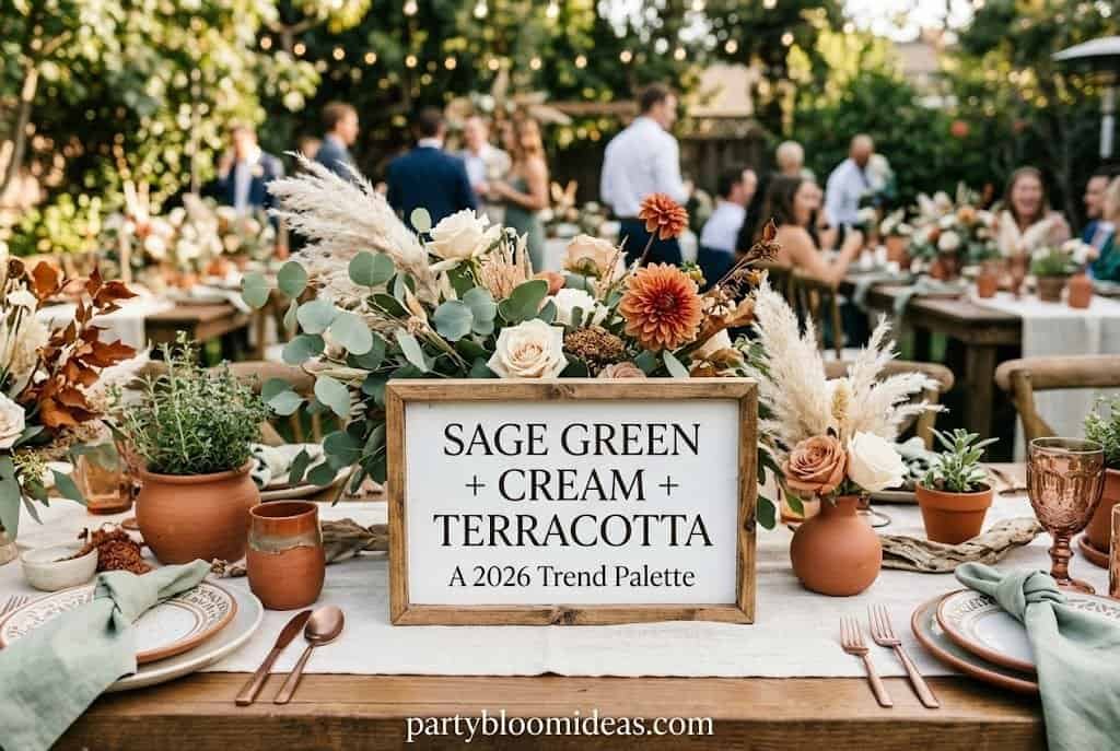
Sage Green + Cream + Terracotta
This combination is everywhere in 2026, and for good reason — it works for almost every adult occasion without trying too hard. Sage green paper napkins, a cream tablecloth, and terracotta mini pots with dried flowers can come in around $28 and photograph like a styled shoot.
Color breakdown: Sage green (dominant) + cream (supporting) + terracotta (10% accent). The mood it creates is warm, earthy, collected-over-time.
Key décor: sage balloon clusters, cream linen table runner, terracotta ceramic or plastic pots, dried pampas grass, natural wood accents. Food direction: charcuterie on wooden boards, cream-colored desserts, herb-garnished drinks in clear glasses.
Budget: $40–$80 for 15–20 guests. Best for: Bridal showers, adult birthdays, gender-neutral baby showers. Difficulty: Easy | Setup time: 1 hour.
💡 Pro Tip: Buy sage green napkins at a dollar store ($1.25 per pack of 20) and pair with cream candles. Skip the matching paper plates — white works perfectly and costs less.
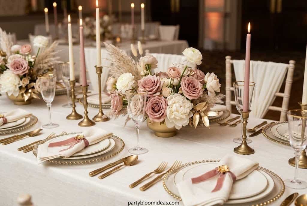
Dusty Rose + Gold + Ivory
If there’s one palette that never fails for a bridal shower or milestone birthday, this is it. Done right, it feels romantic without being saccharine — the gold elevates the rose, and the ivory stops it from going too sweet. Done wrong — when everything is the exact same pink and nothing is ivory or warm white — it reads like a Pepto-Bismol display. Tonal variation is what saves it.
Color breakdown: Dusty rose (dominant) + ivory (supporting) + gold (accent).
Key décor: dusty rose balloon garland, ivory linen napkins, gold foil paper plates, cream taper candles, soft white florals. Food direction: macarons, strawberry-dipped chocolate, cream puffs, rosé in clear flutes.
Budget: $50–$100 for 12–20 guests. Best for: Bridal showers, milestone birthdays (30th, 40th), Valentine’s-adjacent events. Difficulty: Easy | Setup time: 45 minutes.
Gold foil plates ($14 for 30) do more visual work per dollar than almost anything else in this palette.
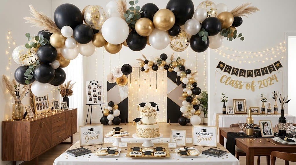
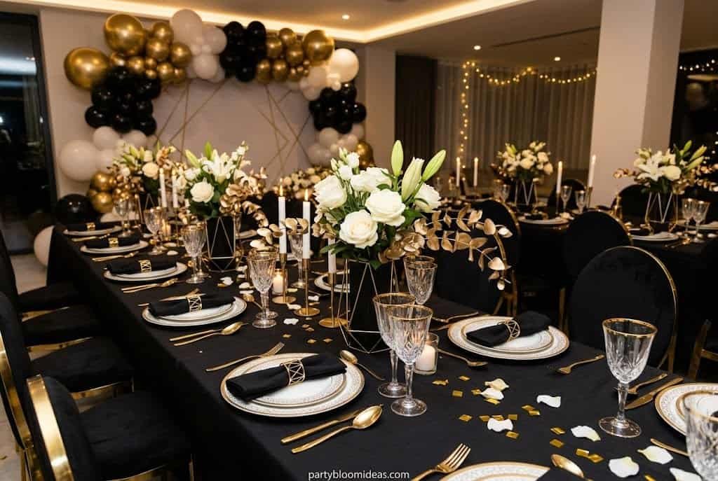
Black + White + Gold
This is the palette to reach for when someone says “elegant, but not stuffy.” It works for every age group, every venue, every season, and photographs beautifully in any lighting. A black-and-white checkered tablecloth, gold star balloons, and white hydrangeas in a clear vase look like you hired someone — for well under $50.
Color breakdown: Black (dominant) + white (supporting) + gold (accent).
Key décor: black tablecloth or backdrop, white florals, gold balloon cluster, black-and-white striped straws, gold metallic charger plates. Food direction: white cake with gold leaf detail, black and white cookies, champagne, dark chocolate bark.
Budget: $45–$90 for 15–25 guests. Best for: Graduations, NYE, adult milestone birthdays (30th, 40th, 50th). Difficulty: Easy | Setup time: 45 minutes.
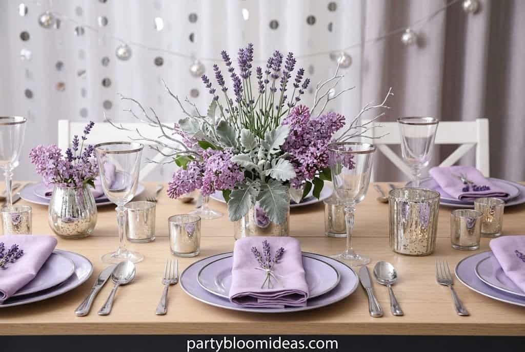
Lavender + Lilac + Silver
This palette reads “dreamy” without going childish — harder to pull off than it sounds. The key is using two shades of purple (not one flat lavender) plus silver instead of gold, which keeps the whole thing feeling modern rather than little-girl. If you’re hosting in a small living room, keep the palette to lavender and ivory only, with silver as a single metallic accent — small spaces can’t absorb three saturated colors without feeling chaotic.
Color breakdown: Lavender (dominant) + lilac (supporting) + silver (accent).
Key décor: lavender balloon arch, white tulle table skirt, silver foil number balloons, white or cream flowers, silver ribbon.
Budget: $55–$110 for 12–20 guests. Best for: Baby showers, girls’ birthdays (ages 5–10), bridal showers. Difficulty: Medium | Setup time: 1.5 hours.
💡 Pro Tip: Buy 60–80 lavender and white balloons and cluster them by shade — lighter lavender on one side, deeper lilac on the other — for a two-tone gradient effect that takes about 45 minutes and looks expensive.
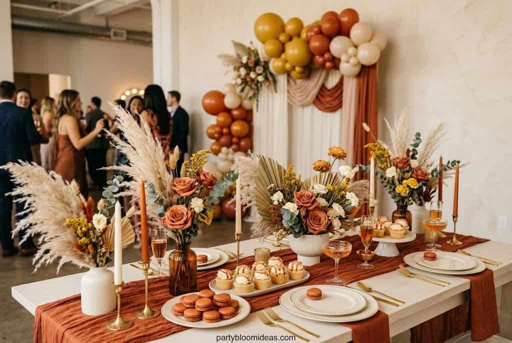
Rust + Burnt Orange + Mustard + Cream
A go-to for any fall gathering: warm, cozy, and beautiful with natural textures — burlap, dried leaves, wood slices, woven runners. Use dried botanicals over fresh flowers; fresh flowers in fall shades are expensive and wilt by hour three, while dried pampas grass and preserved leaves hold up all day and photograph beautifully.
Color breakdown: Rust/burnt orange (dominant) + mustard (supporting) + cream (neutral anchor).
Key décor: rust-toned balloon cluster, mustard linen table runner, dried pampas grass, cream taper candles, burlap ribbon, wood slice centerpieces. Food direction: apple cider bar, caramel desserts, pumpkin-spiced items, warm-color fruit boards.
Budget: $35–$75 for 12–20 guests. Best for: Fall birthdays, Thanksgiving gatherings, outdoor October parties. Difficulty: Easy | Setup time: 30 minutes.
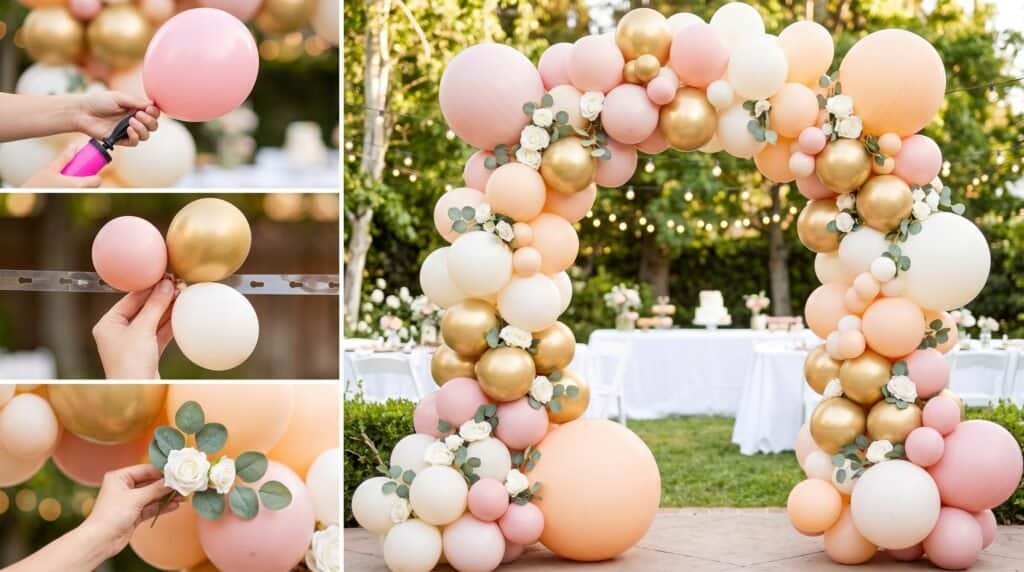
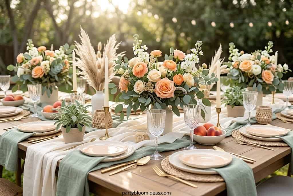
Peach + Sage + Cream (2026’s Biggest Trend)
This is the palette appearing everywhere right now — the evolved version of blush-and-gold: warmer, more editorial, and easier to execute without looking overdone. Searches for sage-green party aesthetics have risen sharply year over year, and peach is quietly replacing blush as the warm accent of choice for 2026.
Color breakdown: Peach (dominant) + sage green (supporting) + cream (neutral).
Key décor: peach dried flower bundles, sage green linen napkins, cream balloon cluster, warm-toned pillar candles, linen tablecloth.
Budget: $45–$85 for 12–18 guests. Best for: Bridal showers, boho baby showers, spring and summer adult birthdays. Difficulty: Easy | Setup time: 45 minutes.
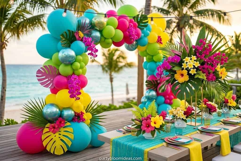
Tropical: Turquoise + Hot Pink + Lime Green + Yellow
This one requires the most discipline of any palette here. Done right, it feels like a party exploded in the best possible way; done wrong, it looks like a dollar-store clearance bin. Every color of the rainbow used individually creates visual overload — nobody knows where to look. The trick with tropical is commitment: repeat each color in at least 3–4 items around the space. One lone yellow balloon looks like a mistake; yellow balloons + yellow paper straws + yellow napkins reads as intentional.
Color breakdown: Turquoise (dominant) + hot pink (supporting) + lime green + yellow (accents).
Key décor: tropical multi-color balloon pack, giant leaf paper plates, bright paper straws, pineapple and flamingo accents, colorful drink dispensers.
Budget: $40–$80 for 15–25 guests. Best for: Pool parties, luau birthdays, kids parties (ages 5–12), summer BBQs. Difficulty: Medium | Setup time: 1 hour.
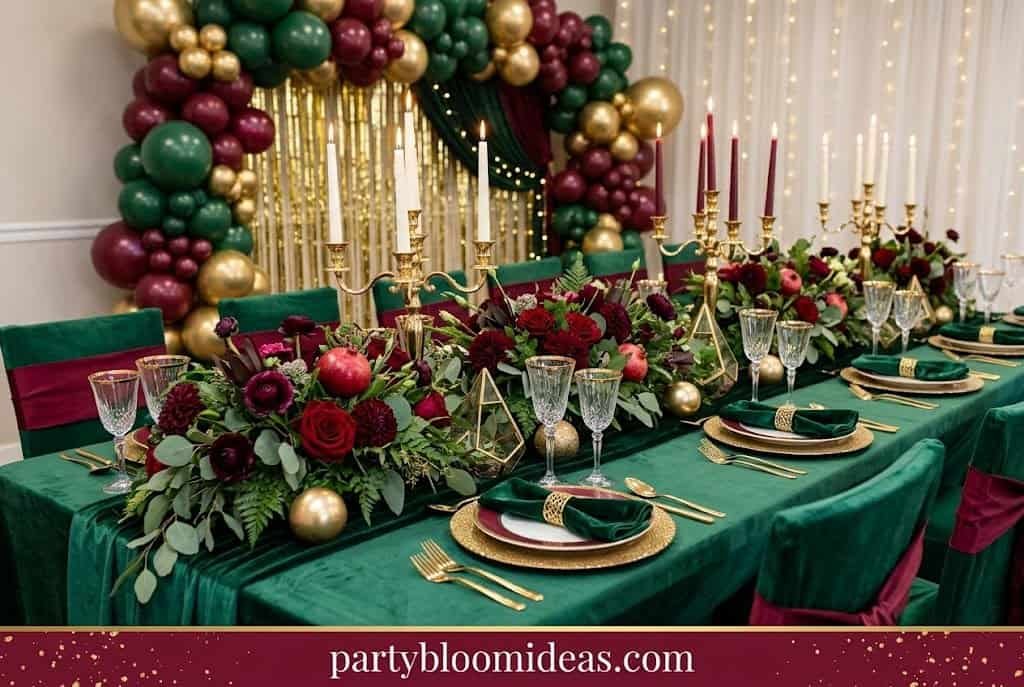
Forest Green + Burgundy + Gold
Moody, rich, and exactly right for holiday gatherings — what a Christmas party looks like when it’s executed with intention instead of pulled from the same seasonal aisle everyone else hits. Forest green velvet ribbon on the table, burgundy taper candles, and eucalyptus create a room that feels like staying; by 8 p.m., nobody wants to leave.
Color breakdown: Forest green (dominant) + burgundy (supporting) + gold (accent).
Key décor: forest green velvet ribbon, burgundy taper candles, gold leaf picks, eucalyptus and cedar sprigs, deep red berries, ivory pillar candles.
Budget: $50–$100 for 15–20 guests. Best for: Christmas parties, winter birthdays, holiday dinner gatherings. Difficulty: Medium | Setup time: 1 hour.
💡 Pro Tip: Burgundy taper candles run about $8 for 12. Line them down the center of a long table with eucalyptus sprigs and you’ve done most of the design work already.
How to Choose a Party Color Palette From Scratch
Step 1: Pick your dominant color. This covers about 60% of visible décor — tablecloths, balloons, the backdrop. It sets the mood.
Step 2: Pick your supporting color. About 30% — napkins, florals, plates, ribbon. It complements without competing.
Step 3: Pick one accent. 10% or less — a metallic, a pop of contrast, something that catches the eye.
Step 4: Add a neutral. White, cream, ivory, or sage green between bold colors gives the eye somewhere to rest and makes everything look more intentional.
Most strong palettes come together in under three decisions.
The Rule of Three: Why Fewer Colors Win Every Time
More than three core colors creates chaos, not celebration. The mistake most hosts make is adding colors because they’re worried the palette will look “too simple” — but simple is almost always the right call.
| Number of Colors | Result |
|---|---|
| 2 colors + 1 neutral | Clean, elegant, always cohesive |
| 3 colors + 1 neutral | Vibrant but controlled — the sweet spot |
| 4 colors | Starts to feel unfocused |
| 5+ colors | Full visual overload |
Color Palettes by Occasion — Quick Reference
| Occasion | Classic Palette | 2026 Trending |
|---|---|---|
| Bridal Shower | Dusty rose + gold + ivory | Peach + sage + cream |
| Baby Shower (neutral) | Sage green + cream + white | Sky blue + lemon + white |
| Kids Birthday | Tropical or pastel rainbow | Hot pink + black (ages 8+) |
| Adult Milestone (30/40/50) | Black + white + gold | Navy + gold + white |
| Graduation | Navy + gold + white | Black + white + gold |
| Fall/Harvest Party | Rust + mustard + cream | Forest green + burgundy |
| Christmas/Holiday | Forest green + burgundy + gold | Deep red + gold + cream |
| NYE | Black + silver + white | Midnight blue + silver |
Common Color Mistakes to Avoid
The biggest mistake most hosts make is buying everything in the same exact shade and calling it a “theme.” What to avoid, and what to do instead:
Over-matching: Plates, balloons, cups, tablecloth, and napkins all in the exact same dusty rose reads stiff, not curated. Use tonal variation — mix dusty rose with blush and ivory within the same palette.
Too many colors: Every color past three dilutes the intentionality of the palette. Three is enough.
Forgetting neutrals: White, cream, or ivory between bold colors gives the eye a place to rest. Without a neutral, even beautiful colors start to clash.
Ignoring your space: Dark-walled indoor venues need lighter, brighter palettes; outdoor afternoon parties can carry richer, deeper tones. The space is part of the design.
Buying décor before committing to a palette: Shopping first tends to leave you with four shades that don’t quite work together and no idea why it looks off. Commit to your palette first, then shop.
The impulse to “do more” is the biggest enemy of a beautiful party. The parties that stick with people are the ones where someone made fewer, smarter decisions.
What Colors Photograph Best at Parties?
If photos matter to you — and they do, because that’s what you’ll share — dusty rose, sage green, and ivory photograph warmly and glow under natural daylight. Black, white, and gold look striking in evening lighting under string lights or Edison bulbs. Bright tropical colors pop in full sun but can wash out under direct flash. Dark, moody palettes (forest green + burgundy) need good ambient lighting to read well on camera — don’t use them in a fluorescent-lit basement.
💡 Pro Tip: Regardless of your palette, hang a strand of warm white string lights behind your main table. It adds warmth to every photo taken in that direction and takes 10 minutes to set up.
FAQ: Party Color Palette Ideas 2026
How many colors should a party theme have? Stick to 3 core colors maximum — one dominant, one supporting, one accent — plus one neutral (white, cream, or ivory). More than 3 starts to look chaotic rather than celebratory. The most cohesive looks almost always come from 2–3 colors, not 5 or 6.
What are the trending party color palettes for 2026? The biggest 2026 trends are peach + sage + cream (replacing blush + gold as the dominant soft palette), terracotta + dusty rose + ivory, midnight blue + silver, and muted pastel combinations. Earthy, nature-inspired tones are dominating over bright primaries, with sage-green aesthetics rising sharply in search interest.
What colors are best for a baby shower in 2026? Sage green + cream + white is the leading gender-neutral palette. For a girl: lavender + silver or dusty rose + gold + ivory. For a boy: navy + white + gold or sky blue + cream + lemon. Muted pastels photograph better and feel more sophisticated than oversaturated versions.
How do I match colors for a party theme from scratch? Start with one color you love. Find one that sits adjacent on the color wheel (they harmonize naturally) or directly opposite (complementary contrast). Add a neutral. That’s your palette. If you’re unsure whether two colors work together, search them on Pinterest first — your eye will tell you within 10 seconds.
What’s the difference between a color scheme and a party theme? A theme is the concept — boho, tropical, Hollywood glam. A color scheme is how you execute it. Two hosts can both do a “boho theme”: one in sage green + terracotta, one in lavender + cream. They’ll look completely different. The palette is where your version of a theme becomes distinctly yours.
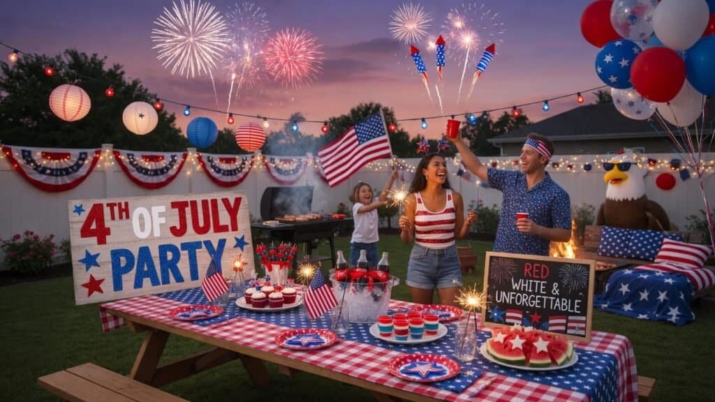
What colors work best for outdoor summer parties? Bright, warm palettes do well in full sun — turquoise + coral, yellow + white, tropical brights. For evening outdoor parties, go richer: forest green + gold, navy + white + ivory, dusty rose + cream. Avoid all-white palettes in direct sun; they bleach out completely in photos.
Can I mix patterns and colors at a party? Yes, but one rule: if you’re mixing patterns (stripes + florals + geometric), keep the color palette tighter — 2 colors max. If you’re working with solid colors only, 3 is fine. Patterns carry visual weight; combining 3 patterns in 4 colors is where it falls apart fast.
What are the best gender-neutral party colors? Sage green + cream, sky blue + lemon yellow, terracotta + ivory, mustard + white + rust. These work for any guest list and any occasion, none require the traditional pink-or-blue binary, and all photograph beautifully.
What colors photograph best at birthday parties? Dusty rose, sage green, and ivory under natural light; black, white, and gold in evening or indoor lighting. Avoid oversaturated neons if you want photos to look editorial. And regardless of palette, warm white string lights behind your main table improve every photo taken there.
How do I pull off a great color palette on a budget? Start at a dollar store — they carry solid-color balloons, napkins, plates, and tablecloths in most major palette shades. Pick 2 colors there ($8–$12 total), add one metallic accent ($10–$15), and use white or cream as your neutral. Under $30 for a cohesive result. Many people spend well over $100 on birthday supplies, but a polished palette costs a fraction of that.
What is the most versatile party color palette? Black + white + gold. It works for every age, occasion, and venue — elegant without being fussy. Second most versatile: sage green + cream + any metallic. Both work indoors and outdoors, daytime and evening.
How do I make colors look cohesive rather than random? Repeat each color at least 3 times across different visual levels: table level (tablecloth, plates), eye level (centerpieces, florals), and overhead (balloons, pendant lights). A dusty rose tablecloth, dusty rose centerpiece flowers, and a dusty rose balloon cluster overhead create instant cohesion — your eye connects the dots.
Read More: 17 Halloween Wood Crafts That Sell Fast (DIY Ideas for Craft Fairs & Etsy)
Fall Party Ideas for a Cozy Harvest Celebration (2026)
Retirement Party Ideas to Honor an Amazing Career